Creating a Visual Brand Guide: A Step-by-Step Process
Imagine having a secret blueprint that keeps your brand looking sharp, polished, and unmistakably you across every platform. That’s where a visual brand guide comes in. Whether you’re launching a fresh startup or leveling up an established business, a brand guide is your go-to for brand consistency, creativity, and cohesiveness.
It’s more than a document—it’s your brand’s personal stylebook, and creating a brand guide will make your life so much easier.
Ready to dive in? Let’s walk through the process of creating a brand guide that brings your vision to life, with some tips and practical examples along the way.
What is a Visual Brand Guide?
Think of a visual brand guide as your brand’s ultimate roadmap—a guide that keeps everything from logos to typography aligned, making sure your brand always shows up in its best light. Whether it’s for internal teams, partners, or that last-minute social post, it’s your trusty sidekick for building recognition, trust, and saving the day when you’re faced with design choices
Step 1: Define Your Brand’s Core Elements
Before you can dive into the visuals, let’s zoom out and figure out who you are at the core. Your mission, values, and personality are the heartbeats of your brand—they’re what make you you.
Mission and Values: What are you here to do? What’s the change you want to make? These are the guiding stars that influence everything from your color palette to your tone.
Brand Personality: Are you quirky, serious, adventurous, or sleek? Define it! This shapes your visual style and lets your audience know what kind of party they’re walking into.
Target Audience: Who are your people? Knowing your audience is key to making design decisions that resonate. Speak their language (visually!).
Step 2: Logo Usage Guidelines
Your logo is the face of your brand—so treat it like the cornerstone it is! Having clear logo usage guidelines on how (and how not) to use your logo will keep everything looking top-notch.
Primary Logo: Where should it go? What’s the minimum size? These rules keep your logo looking fabulous everywhere—from business cards to billboards.
Logo Variations: Sometimes your logo needs to switch it up for different formats (social media, we’re looking at you). Make sure you’ve got guidelines for when to use each version.
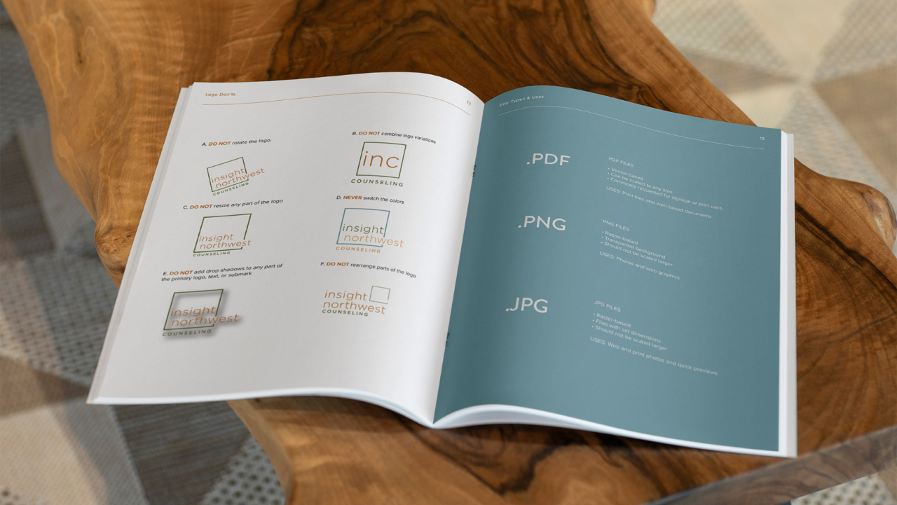
Logo Don’ts: No stretching, squishing, or awkward color combos. Show some love with clear “what not to do” examples.
Step 3: Color Palette
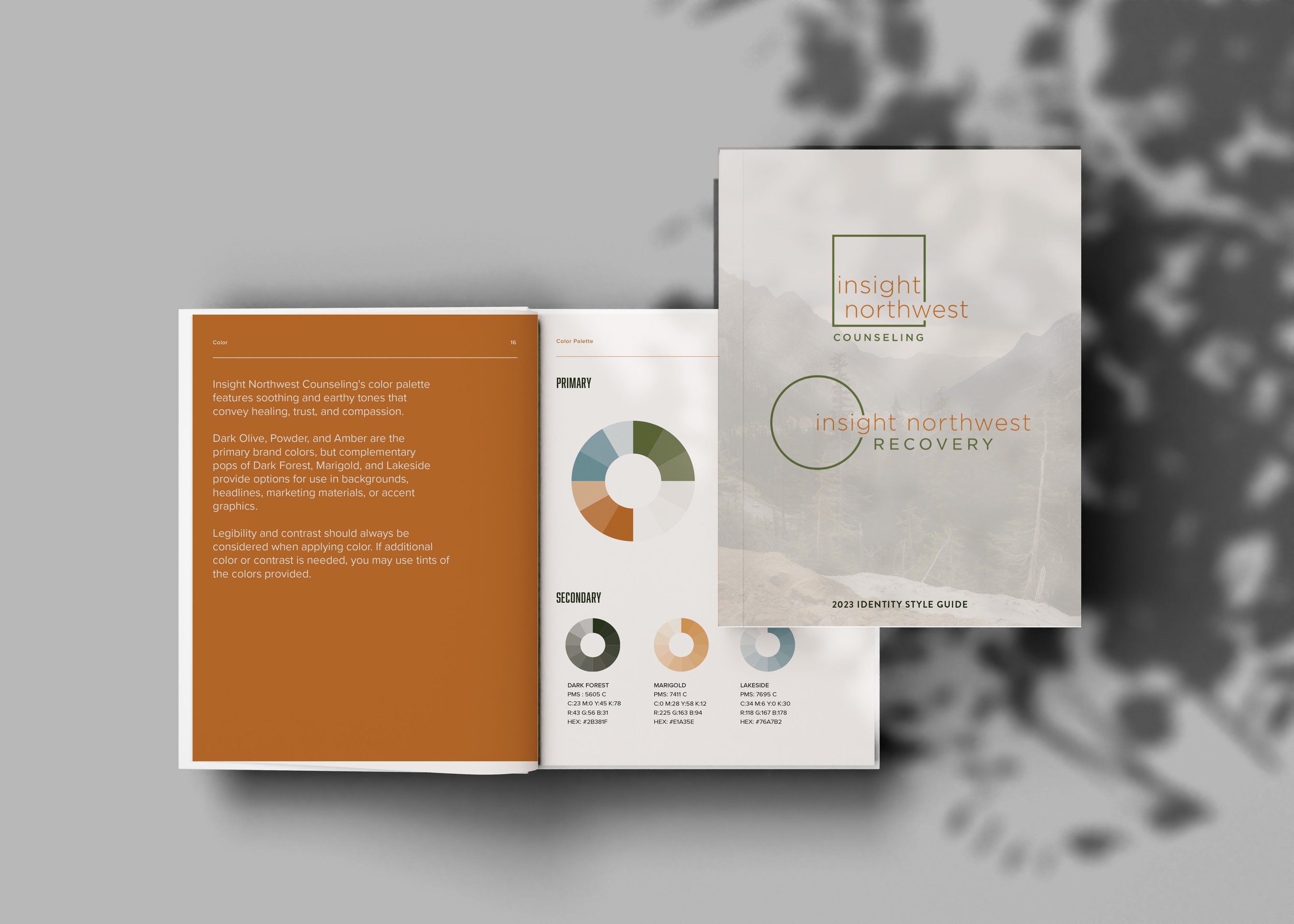
Color is more than something nice to look at—it’s what helps your visual brand connect with and draw out your audiences emotions. Your palette sets the mood and tells a story without saying a word. Be sure to include these in your color palette guide:
Primary Colors: These are your brand’s signature shades—the ones everyone will recognize as you. Choose hues that represent your mission and speak to your audience.
Secondary Colors: These are the accents that bring depth and variety to your designs. Think of them as the supporting colors to your primary palette, and should be used sparingly.
Color Codes: Want your colors to look great across all mediums? Share the exact HEX, RGB, and CMYK codes to keep things consistent.
Step 4: Typography Guidelines
Fonts aren’t just letters— typography in branding set the whole mood of your brand. Choosing the right ones will help your brand's personality shine through in every word.
Primary Typeface: Your go-to font for big moments (like headlines or web content). It should be easy to read and align with your brand vibe.
Secondary Typeface: Use this for subheadings or special accents. It should complement your primary font without stealing the spotlight.
Font Sizes and Styles: Don’t leave your team guessing—give clear rules for font sizes, line spacing, and styles.
Step 5: Imagery & Photography Style – Set the Scene
A picture is worth a thousand words, and in branding, it might be worth even more. The right images pull your audience right into your world.
Imagery Guidelines: What’s the vibe? Candid? Professional? Dreamy? Define the overall style so that every image stays on-brand.
Photography Guidelines: Filters, composition, themes—these little details matter! Lay out the rules for consistency.
Illustrations: If you use icons or illustrations, spell out the specifics—line weight, style, and color, all need to align with your brand.
Step 6: Layout and Composition
Consistency isn’t just about the visuals; it’s about how you arrange them! Your layout and composition should follow a clear structure, whether it’s for web or print.
Grid Systems: Keeping your layouts structured ensures everything feels aligned and polished.
Spacing and Alignment: Margins, white space, and alignment—these details create that pro-level look that sets your brand apart.
Step 7: Templates
Templates are your secret weapon. They save time and ensure consistency. Double win!
Document Templates: Think letterheads, social media posts, or presentations. Your team will thank you!
Marketing Materials: Flyers, brochures, emails—templates keep things cohesive across the board.
Step 8: Spread the Word – Distribution and Implementation
Now that your brand identity guide is ready, make sure everyone’s in the know. Share it with your team, partners, and vendors to keep the magic alive.
Distribute the Guide: Make it accessible to everyone who touches your brand—from designers to social media managers.
Enforce Brand Guidelines: Regular check-ins and feedback sessions will help everyone stay on track. Keep your brand looking top-notch consistently.
Ready to Refine Your Brand?
A visual brand guide isn’t just a reference—it’s your brand’s passport to consistent, unforgettable impact. If you’re ready to create a custom guide that will bring your vision to life, let’s make it happen! Reach out to Northwest Brand Design today, and let’s turn your brand into the showstopper it was meant to be.


