Logo Series: Diving Into the Various Types of Logos

Logos are more than just pretty designs; they're the heartbeat of a brand. Think about it. When you see that iconic swoosh, doesn't Nike instantly come to mind? Or when you spot that simple, yet elegant apple, don't you immediately think of Apple Inc.? That's the power of a logo. It's a visual representation that speaks volumes for a brand, encapsulating its essence, values, and personality all in one design.
Now, you might be wondering, "Why is a logo so crucial?"
Well, it's all about brand recognition. In today's cluttered market, standing out is paramount. And a well-designed logo can be the catalyst to gaining clients and establishing a memorable brand name. It's not just about aesthetics; it's a strategic tool that can drive business growth. A logo is the cornerstone of visual branding, and when done right, it can be a game-changer for your brand strategy.
But here's the thing: not all logos are created equal. There are various types, each with its unique characteristics and purposes. In this guide, we'll delve deep into the world of logos, exploring the different types that exist. From Wordmark and Lettermark to Symbol or Icon, Combination, Emblem, Abstract, Minimalist, and Animated - we'll cover them all. So, whether you're a budding entrepreneur crafting your brand's visual identity or a design enthusiast, this branding guide is tailored for you.
So, are you ready to embark on this journey? Let's dive in and unravel the intricacies of logo design, ensuring your brand strategy is on point!
Understanding Logo Types
At its core, a logo is a symbol that represents your brand. But, trust me, it's so much more than just a pretty picture. Think of it as your business's face, its personality, its mission, and values, all wrapped up in one neat design. A well-crafted logo can be a magnet, drawing your ideal audience towards your brand. On the flip side, a hastily put-together logo? Well, it might just do the opposite.
Now, you might think, "It's just a logo, right? How hard can it be?" But there's a world of difference between a logo that's been slapped together and one that's been meticulously designed to convey the heart and soul of a business. And that's where the magic of logo designs comes into play.
Diving into the Different Logo Types
Logos aren't just random designs; they fall into specific categories based on their design and elements. Whether you're looking at the iconic Apple logo or the simple elegance of the Google wordmark, each logo type serves a unique purpose and conveys a different message.

https://www.creativebloq.com/news/coca-cola-logo-history
Wordmarks
These are logos that are built around a brand's name. Think Google or Coca-Cola.

https://en.m.wikipedia.org/wiki/File:HBO_logo.svg
Lettermarks
These focus on initials or acronyms. HBO and IBM are classic examples.

https://www.dis-discount2023.com/?category_id=17144452
Symbol or Icon Logos
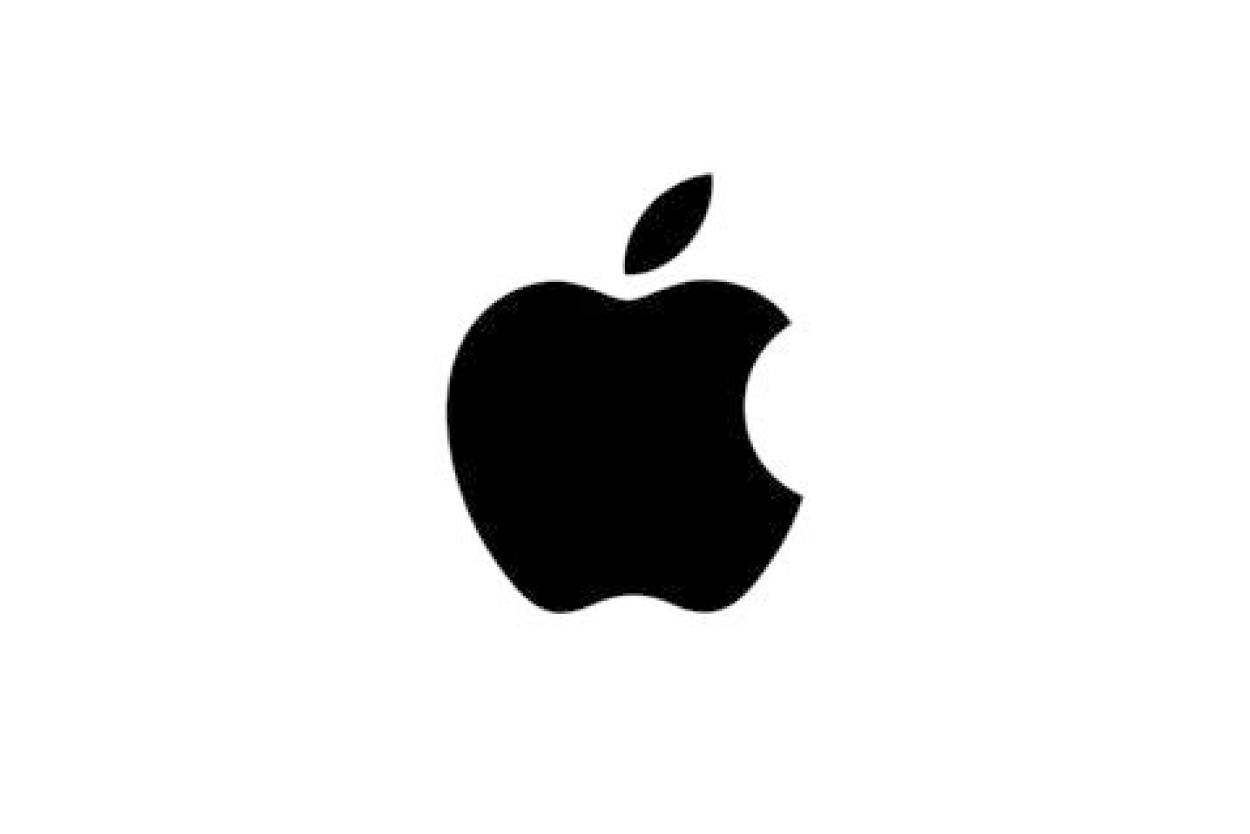
These are logos that use symbols to represent the brand, like Apple's apple or Nike's swoosh.

https://blog.logomyway.com/mcdonalds-logo-history/
Combination Logos
A blend of text and symbols, like the golden arches of McDonald's combined with its name.

https://en.wikipedia.org/wiki/Harley-Davidson
Emblem Logos
Think badges, seals, and crests. Harley-Davidson's logo is a great example.
https://seeklogo.com/vector-logo/272806/airbnb
Abstract Logos
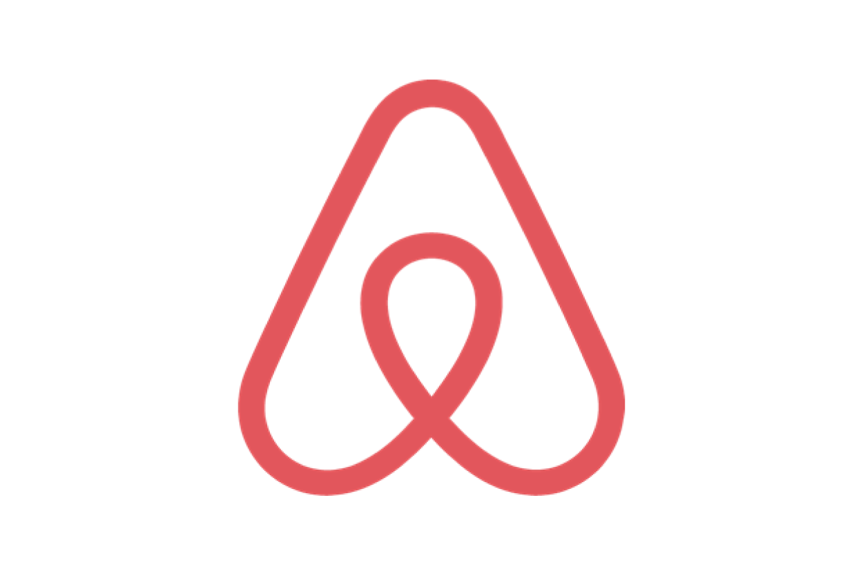
These use geometric forms to represent the brand, like Pepsi's circle or Airbnb's looping A.

https://seeklogo.com/vector-logo/198846/tony-the-tiger
Mascot Logos
These feature illustrated characters. Tony the Tiger for Frosted Flakes, anyone?

https://www.iconfinder.com/icons/5296514/bird_tweet_twitter_twitter_logo_icon
Minimalist Logos
Clean, simple, and to the point. The Twitter bird is a perfect example.

https://uxdesign.cc/10-eye-catching-logo-animations-youll-wish-you-made
Animated Logos
These are logos brought to life through animation, adding a dynamic touch to branding.
Each of these logotypes offers a different flavor, and the best part? There's no one-size-fits-all. The right logo for your brand hinges on your brand's personality, your audience, and, of course, your personal preference.
But how to choose?
Keep reading to learn more about the benefits of each type of logo.
Wordmark Logos
Ah, the world of wordmark logos! If you've ever taken a stroll down a busy street or browsed through your favorite online platforms, you've undoubtedly come across these. But what exactly are they?
Definition and Characteristics of Wordmark Logos
At its core, a wordmark logo, often referred to as logotypes or word marks, is a text-only typographic representation of a brand's name. Think of it as the face of the brand, distilled down to its most basic form: its name. But don't let its simplicity fool you. Crafting the perfect wordmark logo requires a keen eye for design, a deep understanding of the brand's story, and a touch of creativity. It's all about selecting the right font, spacing, and sometimes a dash of color to convey the brand's essence.
Famous Examples of Wordmark Logos
Some of the most iconic brands have chosen the wordmark route, and their logos have become synonymous with their brand story. Take Google, for instance. Its colorful and straightforward logo is instantly recognizable worldwide. And who can forget the elegant cursive of Coca-Cola? It's a testament to the power of a well-designed wordmark logo. These famous examples underscore the impact such logos can have in etching a brand's identity in the minds of consumers.

https://www.creativebloq.com/news/coca-cola-logo-history

https://uxdesign.cc/10-eye-catching-logo-animations-youll-wish-you-made
Advantages and Considerations of Using Wordmark Logos
Now, you might be wondering, "Why opt for a wordmark logo?" Well, for starters, they're incredibly versatile. Whether on a business card, a billboard, or a website header, they fit seamlessly. Their simplicity ensures they're easily recognizable, fostering instant brand recognition.
However, while wordmark logos have their perks, they also come with considerations. The key lies in ensuring the logo remains unique and doesn't echo another brand's design too closely. After all, in the vast sea of brands, you'd want yours to stand out, wouldn't you?
Moreover, the choice of typography plays a pivotal role. It needs to resonate with the brand's personality while being legible across various mediums. Remember, a logo is more than just a name; it's a story, an identity, and the first impression many will have of your brand.
So, as you embark on your branding journey, consider the power of wordmark logos. They might seem simple, but with the right design, they can speak volumes.
What are Lettermark Logos?
Imagine you're sipping your morning coffee, browsing through the news, and you come across those iconic initials – HBO. That's right, "Home Box Office." This is a classic example of a lettermark logo. Essentially, a lettermark logo, sometimes referred to as a monogram logo or letterform logo, is all about simplicity and elegance. It focuses on initials or acronyms to represent a brand. The beauty of these logos lies in their ability to convey the heart and soul of a business in just a few letters. They're concise, clear, and incredibly impactful.
Showcasing the Stars of Lettermark Logos
Let's talk about some famous examples. IBM, with its bold blue letters, stands out as a beacon of technology and innovation. HBO, our beloved "Home Box Office," promises quality entertainment every time its logo graces our screens. These brands have effectively used lettermark logos to carve a niche for themselves in our minds. Their logos are not just letters; they're stories, values, and promises wrapped up in a neat little package.

https://en.m.wikipedia.org/wiki/File:HBO_logo.svg

https://freebiesupply.com/logos/ibm-logo/
When Should You Opt for a Lettermark Logo?
Now, you might be wondering, "Is a lettermark logo the right choice for my brand?" Well, if your company has a long name or is commonly recognized by its initials, then a lettermark might be the way to go. They're especially useful for businesses that have names that might be challenging to pronounce or remember. By using logos or letter marks, you're giving your audience an easier way to recognize and recall your brand. Plus, there's an added bonus: they're incredibly versatile. Whether it's a business card, a billboard, or a website header, a lettermark logo fits seamlessly.
In the vast ocean of branding, where every brand is vying for attention, a lettermark logo can be your anchor. It's simple, it's elegant, and most importantly, it's uniquely you. So, as you embark on your branding journey, remember the power of initials and acronyms. They might just be the key to unlocking your brand's potential.
Symbol or Icon Logos
You've probably come across logos that instantly evoke a brand's essence without uttering a single word. These are symbol or icon logos, and they're more powerful than you might think.
Definition and Significance of Symbol or Icon Logos
Imagine you're walking through a bustling city, and amidst the sea of advertisements, one symbol catches your eye - the iconic Apple logo. Or perhaps you're watching a sports game, and you spot the unmistakable Nike swoosh on an athlete's shoe. These are not just random designs; they're symbol logos. At their core, symbol logos are visual representations that capture the essence of a brand without relying on text. They're like a brand's silent ambassador, speaking volumes without saying a word.
Illustration of Iconic Symbol Logos
Let's dive a bit deeper. Think about the Apple logo. It's not just an apple with a bite taken out of it; it represents innovation, quality, and a touch of luxury. Similarly, the Nike swoosh isn't just a checkmark. It embodies athleticism, performance, and determination. These pictorial logos or pictorial marks are more than mere images; they're stories, values, and missions encapsulated in a design. And when done right, they can be as recognizable as the brand's name itself.
https://www.dis-discount2023.com/?category_id=17144452
https://www.designrush.com/best-designs/logo/apple-3
How Symbol Logos Convey a Brand's Essence Without Words
Now, you might wonder, how do these logos do it? How can a simple design convey so much? It's all about intentionality. A well-crafted logo symbol is the result of deep thought, understanding the brand's heart and soul, and translating that into a visual form. It's about capturing the brand's personality, mission, and values in one little design. When you see the Apple or Nike logo, you don't just see companies; you see innovation, luxury, athleticism, and so much more. It's a visual shorthand for everything the brand stands for.
So, next time you're considering a logo for your brand, think about the power of symbols. They might be silent, but they speak louder than words ever could. And if you ever need guidance on crafting that perfect symbol logo, remember that the key lies in simplicity, uniqueness, and a deep understanding of your brand's essence.
Combination Logos
You've probably come across logos that seamlessly blend text and symbols, haven't you? These are what we call combination logos. Just like a perfect recipe, a combination logo comprises both text and symbols to create a harmonious and memorable design. Let's dive deeper into the fascinating world of combination logos.
Combination Logos that Merge Text and Symbols
Imagine you're at a party, and you're introduced to a duo that perfectly complements each other. One's the talker, and the other's the showstopper. That's precisely what combination logos are like. They merge the clarity of text with the visual appeal of symbols, ensuring that your brand's message is both seen and heard. When done right, they can be a powerful tool in your branding arsenal.
Examples of Successful Combination Logos
Take McDonald's, for instance. The iconic golden arches paired with the brand's name is a classic example of a combination mark logo. It's instantly recognizable, isn't it? Then there's Adidas, with its three stripes and brand name. These brands have mastered the art of combining logo marks and text to create a lasting impression. Their logos aren't just symbols; they tell stories, evoke emotions, and build trust.
https://blog.logomyway.com/mcdonalds-logo-history/

https://logos-world.net/adidas-logo/
Benefits of Combination Logos in Establishing Brand Identity
Now, you might wonder, why opt for logo combinations when you can choose either text or symbols? Well, combination logos offer the best of both worlds. They provide clarity through text and add a visual element that resonates with the audience. This dual approach ensures that even if someone doesn't recognize the symbol, the text will guide them. Moreover, a combination mark offers versatility. Whether you're printing it on business cards or splashing it across billboards, it remains consistent and impactful.
Remember, your logo is more than just a design. It's the face of your brand, a visual representation of your company's values, mission, and personality. So, when you choose a combination logo, you're opting for a design that's both informative and illustrative. It's like having a spokesperson and a mascot, all rolled into one.
Emblem Logos
Ah, emblem logos. You've probably seen them more times than you can count, but have you ever stopped to think about what makes them so special? Let's dive in.
Emblem logos, in essence, are like the classic badges of the branding world. They seamlessly blend text and symbols, often encapsulating the brand's name or initials within a detailed design. Think of them as the coat of arms for brands. The text, often found snugly inside these symbols, is where the magic of "fonts inside" comes into play. This combination creates a cohesive look that's both distinct and memorable. It's like wrapping up the essence of a brand in a neat little package, ready to be presented to the world.
Historic Emblem Logos and Their Timeless Appeal
Some emblem logos have stood the test of time, becoming iconic in their own right. Take Harley-Davidson, for instance. Its emblem logo is more than just a brand mark; it's a symbol of freedom, adventure, and the open road. Such brands have leveraged the power of emblem logos to create a lasting legacy. These "branding marks" are not just logos; they're stories, histories, and emotions all rolled into one.
https://en.wikipedia.org/wiki/Harley-Davidson
Challenges and Creative Opportunities in Designing Emblem Logos
But, as with all things design, emblem logos come with their own set of challenges. The very nature of these logos, with intricate designs and "fonts inside" symbols, can sometimes make them hard to reproduce on smaller scales or different mediums. Remember, a logo should be versatile, and with emblem logos, achieving that versatility can be a tad bit tricky.
However, every challenge presents an opportunity. Designing emblem logos can be a playground for creativity. Think about it: you have the chance to craft a unique narrative for a brand, combining text and imagery in a harmonious dance. And if you ever feel stuck, there are always "design contests" and communities out there to provide inspiration and feedback.
So, next time you come across an emblem logo, take a moment to appreciate the artistry and thought that went into it. And if you're considering one for your brand, remember: it's not just about creating a logo; it's about crafting a legacy.
Abstract Logos
You've probably come across logos that don't immediately spell out the company's name or its function but instead use intriguing shapes and designs to represent the brand. These are what we call abstract logos.
What Are Abstract Logos?
Abstract logos are a fascinating blend of visual ideas and design creativity. Unlike pictorial logos that might show a recognizable image, like a tree or an apple, abstract logo marks use shapes and forms in unique ways to represent a brand. Think of the swirling red, white, and blue globe of Pepsi or the simple yet distinct design using a combination of iconography for Airbnb. These logos don't give away what the company does at first glance, but they are unmistakable once you're familiar with them.
https://seeklogo.com/vector-logo/272806/airbnb

https://bemysocial.com/pepsi-logo-design-and-inspiration/
The Power of Geometrical Shapes
Many abstract logos lean heavily on geometrical shapes. These shapes, whether they're squares, triangles, circles, or more complex patterns, can evoke specific emotions in viewers. A triangle might convey stability or upward movement, while a circle could suggest community, unity, or wholeness. The beauty of these logos is that they can convey a brand's essence without being overtly obvious about it.
Eliciting Emotion and Curiosity
One of the most powerful aspects of abstract logos is their ability to evoke emotion and curiosity. When you see an abstract mark, you can't help but wonder what it represents. This curiosity can draw customers in, making them want to learn more about the brand. Moreover, the unique combination of shapes and designs can elicit specific feelings, whether it's the excitement, trust, or a sense of belonging.
Why Choose an Abstract Logo?
If you're looking to stand out and not be boxed in by the literal elements of your business, an abstract logo might be the way to go. They offer a level of versatility that other logo types might not, as they're not tied to a specific image or idea. This means as your business evolves, your logo can still remain relevant.
Remember, while the design might seem simple, a lot of thought goes into creating an abstract logo. It's about distilling the essence of your brand into a design that's both intriguing and memorable. So, next time you see a logo and think, "What is that supposed to be?", take a moment to appreciate the creativity and strategy behind it.
Mascot Logos
Ah, mascot logos! They're a delightful blend of character, charm, and brand representation. When you think of some of the most iconic brands, it's hard not to picture their cheerful mascots. Let's dive into the world of mascot logos and see what makes them tick.
Introduction to Mascot Logos
You've seen them everywhere - from cereal boxes to sports teams. Mascot logos are those delightful characters that give a face to a brand. They're not just any face; they're a personality, an ambassador, and sometimes even the heart and soul of a brand. When done right, a mascot logo can speak volumes, capturing the essence of your brand's personality and values in a way that's both engaging and memorable.
Examples of Mascot Logos That Add Personality to Brands
Let's take a stroll down memory lane, shall we? Remember the Colonel from KFC? That iconic face is more than just a logo; it's a representation of the brand's history, quality, and values. And who can forget the dapper Pringles man? With his suave mustache and bowtie, he's the epitome of the brand's playful and unique personality. These are just a couple of examples, but the world is full of mascot logos that have left an indelible mark on our minds.

https://www.nbcnews.com/id/wbna15705220

https://www.designweek.co.uk/issues/20-26-september-2021/pringles-rebrand/
Factors to Consider When Using Mascot Logos
Your Brands Personality: Just like you, every brand has a unique personality. Your mascot should be a reflection of that. Whether it's playful, serious, quirky, or elegant, ensure your mascot resonates with your brand's core values and ethos.
Relevance: While it's tempting to go for a cute character, always ask - does it fit with what my brand stands for? A mismatched mascot can confuse your audience and dilute your brand message.
Adaptability: Mascots will be featured in various product updates, marketing materials, and campaigns. Ensure your mascot is versatile enough to fit different scenarios and mediums without losing its charm.
Memorability: The goal is to have a mascot that sticks. It should be unique, easily recognizable, and something that people can instantly associate with your brand.
Evolution: Brands evolve, and so should mascots. While consistency is key, it's also essential to ensure your mascot remains relevant and resonates with the changing times and audience preferences.
Mascot logos are more than just cute characters. They're powerful branding tools that, when used right, can elevate your brand's identity and create lasting connections with your audience. So, next time you think of a mascot, remember - it's not just about the looks; it's about the story, the personality, and the values it brings to the table.
Minimalist Logos
Minimalist logos are all about embracing simplicity. They strip away the fluff and focus on the essentials. Think of them as the "less is more" approach to logo design. These logos aren't about being bare or empty; they're about clarity, precision, and directness. Remember, in the world of logo design, less truly is more. A minimalist design can convey the heart and soul of a brand without overwhelming the viewer with too many elements.
Showcasing Minimalist Logos That Communicate with Minimal Elements
Let's take a moment to appreciate some iconic minimalist logos:
Twitter's Bird: A simple, yet instantly recognizable silhouette of a bird. No words, no extra details, just a bird in flight. It's a perfect example of how negative space can be used effectively.
Mastercard: Two overlapping circles with colors that blend in the middle. It's straightforward, but it communicates unity and connection.

https://www.iconfinder.com/icons/5296514/bird_tweet_twitter_twitter_logo_icon

https://en.wikipedia.org/wiki/Mastercard
These logos prove that you don't need a lot to make a strong branded statement. It's all about finding that unique touch that resonates with your audience.
Advantages of Minimalist Logos in a Cluttered Visual Landscape
In today's digital age, we're bombarded with visuals everywhere we look. From billboards to social media feeds, there's a constant stream of images vying for our attention.
This is where minimalist logos shine:
Clarity: They cut through the noise, offering a clear and unambiguous representation of a brand.
Memorability: Their simplicity makes them easy to remember. Think about it, it's easier to recall Twitter's bird than a complex, intricate design, right?
Versatility: Simple designs scale well. Whether it's on a business card or a billboard, a minimalist logo maintains its integrity.
Timelessness: Design trends come and go, but simplicity is timeless. A minimalist logo is less likely to feel outdated as design trends evolve.
So, next time you're thinking about logo designs, consider going the minimalist route. It's not just a design trend; it's a smart branding strategy that resonates in today's cluttered visual landscape.
Animated Logos
You've probably noticed it already. When you open an app or visit a website, the logo doesn't just sit there; it moves, it dances, it tells a story. Animated logos are not just a fleeting trend; they're a reflection of our digital age. They bring a brand's identity to life, adding a layer of depth and personality that static logos can't achieve. Think of it as your brand's way of giving a friendly wave to your audience, saying, "Hey, it's good to see you!"
Animated Logos that Enhance Brand Storytelling
Take Netflix, for instance. When you fire up the app, the iconic 'N' zooms out, creating a sense of anticipation for the binge-worthy content that awaits. Or consider Uber. Its animated logo, with lines and dots converging, mirrors the essence of different paths coming together, much like riders and drivers in their service.

https://dribbble.com/shots/6456962-Uber-Logo-Animation

https://tenor.com/view/netflix-intro-netflix-netflix-opening-gif-21209311
Techniques for Creating Effective Animated Logos
Keep It Simple
Just like with static logos, the key is simplicity. An animated logo should be concise and not too flashy. Remember, the goal is to enhance the brand's message, not overshadow it.
Ensure Consistency
Your animated logo should align with your brand's identity and values. It's an extension of your brand, so it should feel like a natural evolution, not a departure.
Optimize for Different Platforms
Make sure your animated logo looks great on all platforms, whether it's a mobile app, a website, or marketing materials. It should be versatile and adapt to different formats.
Tell a Story
The best animated logos tell a story. They convey the brand's journey, values, or mission in a few seconds. Think about what story you want to tell and how the animation can bring that story to life.
Stay Updated with Design Trends
The world of logo design is ever-evolving. Stay updated with the latest trends, but always ensure that any trend you adopt aligns with your brand's identity.
Animated logos are more than just a design trend; they're a powerful tool that can elevate your brand's presence in the digital space. They can make your brand feel more dynamic, modern, and engaging. So, next time you think about your brand's logo, ask yourself: is it time to bring it to life?
Choosing the Right Type of Logo
Choosing the right logo for your brand is more than just picking a design that looks good. It's about ensuring that the logo represents your brand, resonates with your target audience, and aligns with your brand values.
Let's dive into the factors you should consider when selecting a logo type for your brand.
Your logo should:
1. Represent Your Brand
Your logo is the face of your brand. It's the first thing people see, and it sets the tone for everything else. Think of it as the symbol that represents your brand's personality, mission, and values. It should encapsulate the essence of what your brand stands for. Ask yourself, does the logo truly represent your brand?
2. Match with Your Industry
Different industries have different vibes. A tech startup might opt for a sleek, modern logo, while a bakery might choose something warm and whimsical. Consider the norms of your industry, but don't be afraid to think outside the box. After all, you want a logo that stands out, right?
3. Know Your Audience
Remember, as much as the logo is about representing your brand, it's also about resonating with your target audience. Dive deep into understanding their preferences, pain points, and what appeals to them. Does your logo idea match their expectations and preferences?
4. Align with Brand Values
Your brand values are the core principles that guide your business. They're the beliefs and philosophies you stand by, no matter what. Your logo should be a reflection of these values. For instance, if sustainability is a core value, perhaps incorporating green or earthy elements could be a good fit.
5. Explore Different Logo Ideas
Don't settle on the first design that catches your eye. Explore different logo ideas, play around with concepts, and see which one feels right. Remember, your logo is a long-term commitment. It's worth taking the time to get it just right.
Selecting the right logo type is a blend of understanding your brand, knowing your audience, and aligning with your brand values. It's about finding that perfect design that not only looks good but also tells your brand story. So, whether you're brainstorming logo ideas or deciding on a final design, keep these factors in mind. And if you ever need a helping hand, remember that professional designers have the expertise to bring your vision to life.
Tying it All Together
Logos are more than just symbols; they're the face of your brand, encapsulating its personality, mission, and values in a single design.
Let's take a quick stroll down memory lane:
Wordmark Logos: Think of the iconic Coca-Cola or Google. Simple, yet unforgettable.
Lettermark Logos: IBM and HBO have aced this with their acronyms.
Symbol or Icon Logos: The Apple apple or the Nike swoosh – need we say more?
Combination Logos: McDonald's golden arches with its name is a classic example.
Emblem Logos: Harley-Davidson's emblem is timeless and speaks of legacy.
Abstract Logos: Pepsi's globe or Airbnb's loops are abstract yet evoke specific feelings.
Minimalist Logos: Twitter's bird or Mastercard's circles are the epitome of simplicity.
Animated Logos: Brands like Netflix are revolutionizing branding with motion.
Choosing the right logo type isn't just about aesthetics; it's about resonating with your brand's core identity. It's about ensuring that when someone sees your logo, they feel a connection, they remember it, and most importantly, they trust it.
Remember, your logo is often the first impression your brand makes. And in the world of branding, first impressions matter—a lot. So, whether you're a startup or looking to rebrand, consider the weight of your logo. It's not just a design; it's the heart and soul of your business.
If you're feeling a tad overwhelmed, that's okay. Logo design is an art, and sometimes, it's best left to the professionals. Dive deep into the world of professional logo design and ensure your brand stands tall, proud, and unforgettable.
Ready to embark on a branding journey?
Dive into the world of professional Eugene Oregon logo design and let your brand shine. Explore our services today and schedule a free consultation to see how we can take your logo and brand to the next level.
Ready to Elevate Your Brand's Identity?
Hey there, passionate brand enthusiast! 🌟
Dive Deeper with Us
Curious about the magic behind impactful logo designs? At Northwest Brand Design, we're not just about creating logos; we're about crafting stories, identities, and unforgettable brand experiences. Let's explore the world of logo design together and find the perfect fit for your brand.
Got Questions? We've Got Answers
Whether you're just starting out or looking to revamp your brand's image, we're here to guide you every step of the way. From inquiries to consultations, our team is eager to share insights, answer your burning questions, and showcase our portfolio of success stories.
Let's Connect
Ready to embark on a branding journey that resonates with your vision and values? Reach out to us and let's bring your brand to life. Remember, a logo isn't just an image; it's the heartbeat of your brand. And we're here to make sure it beats loud and proud!a