Logo Series: The Art of Long Logos – Navigating Design Challenges with Lengthy Company Names

In the world of branding, your logo is more than just a visual mark; it's the heart of your brand's identity. As brand identity designers, we understand that a logo is a silent ambassador of your brand. It's not just about creating a pretty symbol; it's about designing a logo that encapsulates the essence of your brand and communicates it effectively to your audience.
Think of some of the most iconic logo designs out there. They're not just memorable; they're a distillation of the brand's values, mission, and personality. This is where the art of design in logos comes into play. It's a delicate balance of aesthetics and strategy, form and function, creativity and clarity. A well-designed logo makes a statement, tells a story, and builds a connection with its audience.
But why is this so important?
In a world where consumers are bombarded with countless brands every day, your logo needs to stand out. It needs to be more than just visually appealing; it needs to resonate with your audience. A great logo design can evoke emotions, foster brand loyalty, and even influence purchasing decisions. It's the first impression you make and often the lasting image people remember.
Moreover, in the digital age, where your brand can be seen across various platforms, consistency in logo design is key. It ensures that your brand is easily recognizable, whether it's on a website, social media, or a billboard. This consistency builds trust and reliability in the eyes of your customers.
A strong logo is the cornerstone of your brand identity. It's a powerful tool that, when designed thoughtfully, can elevate your brand from merely being seen to being remembered and cherished. So, as you embark on the journey of creating or revamping your logo, remember that it's not just about making a mark; it's about making your mark in the minds and hearts of your audience.
Challenges of Long Company Names
When it comes to branding, the name of your business is your first handshake with the world. It's a critical part of your identity, but what if your business name is a long one? Companies with long names face unique challenges in the realm of logo design and brand recognition. It's a puzzle that requires a blend of creativity and strategy to solve.
Imagine trying to fit a lengthy name into a logo. The longer the name, the harder it is to make it memorable and visually appealing. This is where the art of logo design is truly tested. For example, think of some company names examples you know. How do they handle their length in their logos? Some might abbreviate, some might use initials, but each solution comes with its own set of challenges.
readability and scalability
The primary issue here is readability and scalability. A long business name can become a jumble of letters on smaller screens or print sizes, losing its impact and sometimes even its legibility. This is a crucial consideration in our increasingly digital world, where your logo needs to look as good on a smartphone screen as it does on a billboard.
visual clutter
Another challenge is the visual clutter. A logo should be a beacon of your brand's identity, not a source of confusion. When a business name is long, fitting it into a logo without making it look crowded or overwhelming can be a tough nut to crack. It's about finding that sweet spot where the name is readable, the design is aesthetically pleasing, and the brand's essence is clearly communicated.
For businesses grappling with this challenge, it's important to remember that a logo is more than just a name. It's a visual story. It's about finding creative ways to convey your brand's personality and values, even if that means breaking up a long name or using visual elements to complement it. The goal is to create a logo that not only captures the essence of your brand but also resonates with your audience, no matter the length of your name.
Creative Solutions for Long Logos
Navigating the design landscape for companies with lengthy names can be a bit like solving a complex puzzle. But don’t worry, there are creative solutions out there! When it comes to design logos for companies, especially those with longer names, thinking outside the box is key. Let's explore how some brands have turned their lengthy names into memorable, impactful logos.

https://freebiesupply.com/logos/ibm-logo/
abbreviation or acronyms
First, consider the power of abbreviation or acronyms. This approach can transform a lengthy name into something crisp, catchy, and easily recognizable. Take, for instance, International Business Machines. Quite a mouthful, right? But as IBM, it has become iconic. This approach is not just about shortening; it's about creating a new identity that still resonates with the brand's essence.

https://freebiesupply.com/logos/mercedes-benz-logo/
visual elements or symbols
Another effective strategy is the use of visual elements or symbols. Sometimes, a picture really is worth a thousand words. A symbol can convey the spirit of a brand in a way that words alone might not. It can also break up the text, making a long name more digestible and visually appealing. Think of how the three-pointed star symbol effortlessly represents Mercedes-Benz, even without the name attached.
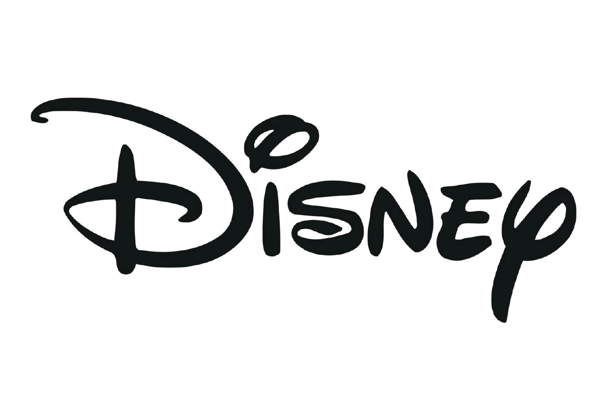
https://commons.wikimedia.org/wiki/File:Disney_wordmark.svg
Typography
Typography also plays a crucial role. The right font can make a lengthy name not only readable but also engaging. It's about finding a typeface that reflects the brand's personality while ensuring legibility. For example, Disney's whimsical script instantly evokes a sense of magic and creativity, perfectly capturing the brand's ethos.

https://1000logos.net/sony-logo/
Simplicity
Let's not forget the power of simplicity. Sometimes, the best approach is to strip back to the basics. Take Sony for example. A minimalist design makes their longer name, Sony Corporation, feel less overwhelming and more elegant. It's about distilling the essence of the brand into its simplest form, which is more impactful than a complex design.
Designing logos for companies with long names is an exercise in creativity and strategic thinking. It's about finding the right balance between readability, memorability, and brand identity. Whether it's through abbreviation, symbolism, typography, or simplicity, there are numerous ways to turn a lengthy name into a powerful brand asset.
Typography Choices
Typography is an art form that speaks volumes in logo design, especially when you're dealing with lengthy company names. The right choice of typeface can transform a cumbersome name into a visually appealing brand identity. Let's dive into how condensed typefaces and thoughtful typography can make all the difference.

Condensed typefaces are a godsend for long names. They allow for more characters in a given space without sacrificing readability. This means you can maintain the integrity of your full name while keeping the design sleek and uncluttered. It's a delicate balance, but when done right, it can make your logo both distinctive and legible. Think about how a poster design captures attention with its bold and clear typography – that's the kind of impact you want your logo to have.
But typography isn't just about fitting letters into a space; it's about conveying your brand's personality. Each typeface has its own character and tone. A serif font might convey tradition and reliability, while a sans-serif could suggest modernity and approachability. The key is to choose a typeface that not only fits aesthetically but also aligns with your brand's values and message.
Moreover, typography in logo design isn't just about the main typeface. It's about how all the textual elements work together. This includes any taglines or additional information that accompanies your logo. Every textual element should complement each other, creating a cohesive and harmonious design.
Typography in logo design is a powerful tool. It's not just about making your name fit; it's about making it speak. With the right condensed typeface and a thoughtful approach to typography, even the longest company name can become a compelling and memorable brand identity.
Simplification and Abbreviation
In the world of logo design, sometimes less is more, especially when it comes to lengthy company names. Simplification and abbreviation can be powerful tools in creating a logo that's not only memorable but also versatile across various mediums, from a business card to packaging designs.

https://www.maisonfrida.com/
Think about the last time you received a business card. The logo is often the first thing that catches your eye. It needs to be clear, concise, and reflective of the brand, all within the confines of a small card. This is where the art of abbreviation shines. By condensing a long name into a few letters or a single word, you create a logo that's not only space-efficient but also impactful.
But it's not just about shrinking the name; it's about maintaining the brand's essence. A well-abbreviated logo retains the core identity of the brand while presenting it in a more digestible format. It's a creative process of distillation, where every letter and shape needs to carry the weight of the entire brand.
The same principle applies to packaging designs and cover design. In these contexts, the logo needs to stand out amidst a sea of information and visual stimuli. A simplified or abbreviated logo can cut through the noise, delivering the brand's message quickly and effectively. It's about creating a visual anchor that draws the consumer's eye and stays in their memory.
Simplification and abbreviation in logo design are not just about making things smaller; they're about making them smarter. It's a strategic approach to ensure that your brand's identity is communicated clearly and memorably, no matter the size or context of the display.
Symbol Integration
In the realm of logo design, especially for companies with lengthy names, the integration of symbols can be a game-changer. As a brand identity designer, we know that a symbol can tell a story, evoke emotions, and create a lasting impression. This approach is not just about aesthetics; it's about crafting a visual narrative that complements and enhances the textual elements of your logo.

www.nwbranddesign.com
Consider the versatility of symbols in design. A well-chosen symbol can make your logo adaptable across various mediums – be it a t-shirt design, a book cover, or a digital ad. On a t-shirt, your logo becomes a wearable piece of art, a symbol that people carry into the world. It's a unique opportunity for your brand to connect with individuals on a personal level.
In the context of book cover design, a symbol can capture the essence of a story or a brand in a single glance. It's about creating an emblem that encapsulates the core themes and values of the brand, much like a book cover encapsulates the essence of its content. A symbol can make a complex or lengthy company name more approachable and relatable.
But how do you choose the right symbol?
It starts with understanding your brand's identity. What are your values, your mission, your story? The symbol should be a reflection of these elements, a visual shorthand that conveys your brand's message at a glance. It's about finding that perfect icon that resonates with your audience and becomes synonymous with your brand.
Symbol integration in logo design is a powerful strategy, particularly for companies with long names. It offers a way to communicate your brand's identity succinctly and memorably. Whether it's on a t-shirt, a book cover, or a business card, a well-designed symbol can elevate your brand and leave a lasting impression.
Tips for Businesses with Long Names
If you're a business grappling with a lengthy name, no need to worry. The journey to a compelling logo can be both exciting and rewarding. At Northwest Brand Design, we've designed for our clients logos that not only resonate with their brand identity but also stand the test of time and trend.
Here are some practical tips to help you navigate this journey.
First, consider the story behind your brand.
Like a history museum, your brand is rich with stories, values, and visions. Your logo should be a reflection of this heritage. It's not just about the name; it's about the narrative that name carries. Think about how you can encapsulate this story in a simple yet powerful design.
Next, don't shy away from design contests or crowdsourcing ideas.
These platforms can offer a plethora of creative solutions and perspectives. However, remember that your logo is the face of your brand. It needs a professional touch to ensure that it not only looks good but also communicates effectively with your target audience.
Now, let's talk about working with professionals.
At Northwest Brand Design, we understand the nuances of logo design for businesses with long names. Our team of designers and brand strategists work closely with you to create a logo that's not just a name but a brand experience. We believe in a collaborative process, where your insights and our expertise come together to create something truly unique.
The Takeaway
In conclusion, your logo is more than just a graphic; it's a symbol of your brand's identity and promise. Whether you're a burgeoning startup or an established enterprise, a well-designed logo can elevate your brand and connect with your audience in meaningful ways.
Ready to transform your lengthy company name into a captivating logo?
Let Northwest Brand Design be your guide. Our team is dedicated to crafting logos that are not just visually stunning but also strategically sound. Contact us today, and let's create a logo that tells your brand's story in a single glance.